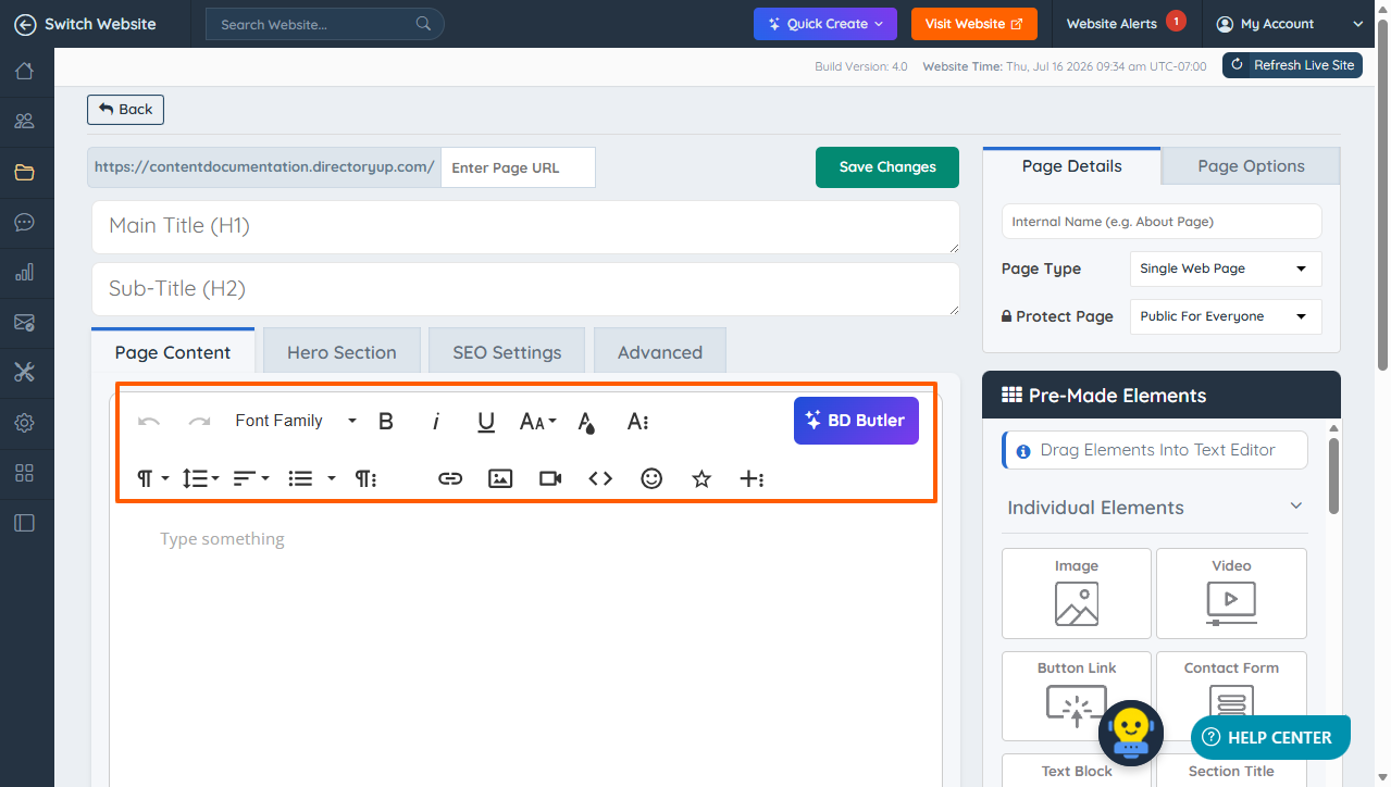
The site administrator or designer can leverage the built-in table functionality within the Froala Editor to seamlessly add and style content on static web pages. This versatile feature is also available for designing and customizing email templates, ensuring a cohesive and professional look across both web and email platforms.
The content can be edited in 2 different ways:
Admin Froala Editor Options
These are available when selecting all the page content, including what is inside and outside of the table.
For more information about Froala Editor options go here: Everything About Froala WYSIWYG Text Editor
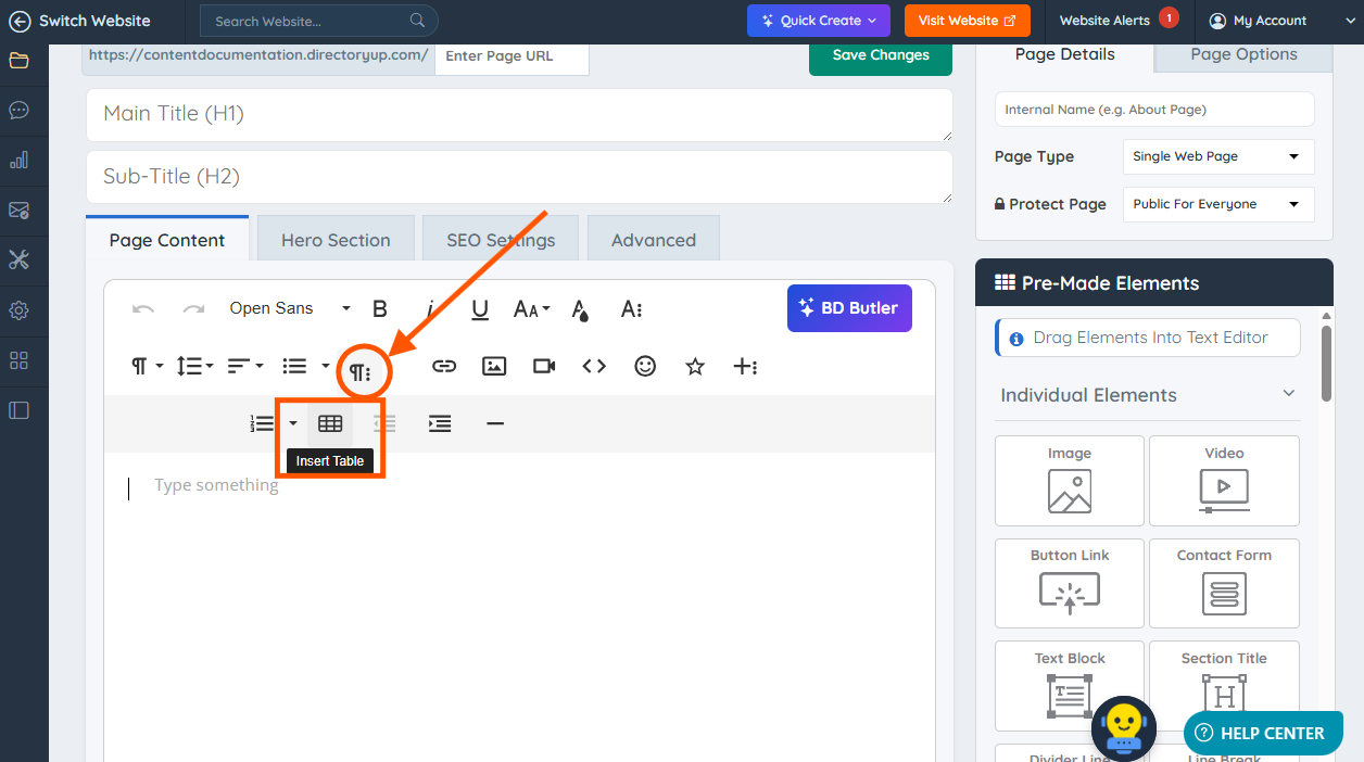
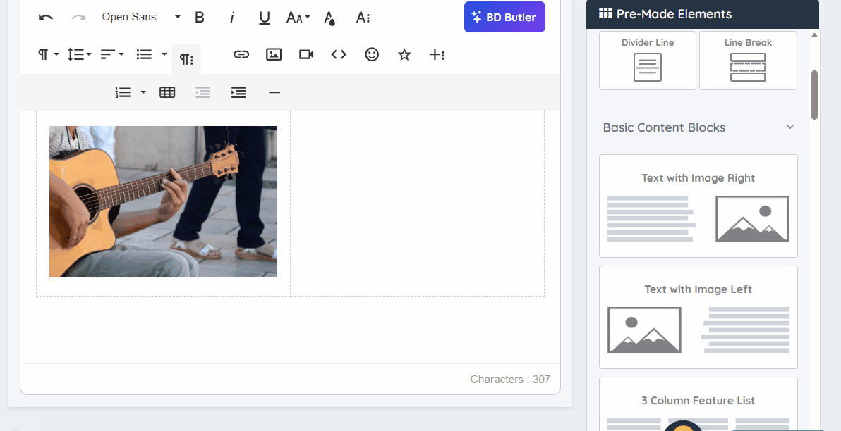
To add a table, click the More Paragraph icon, then select the Table icon.
Using the Froala Table Options
These apply for the columns, rows and cells.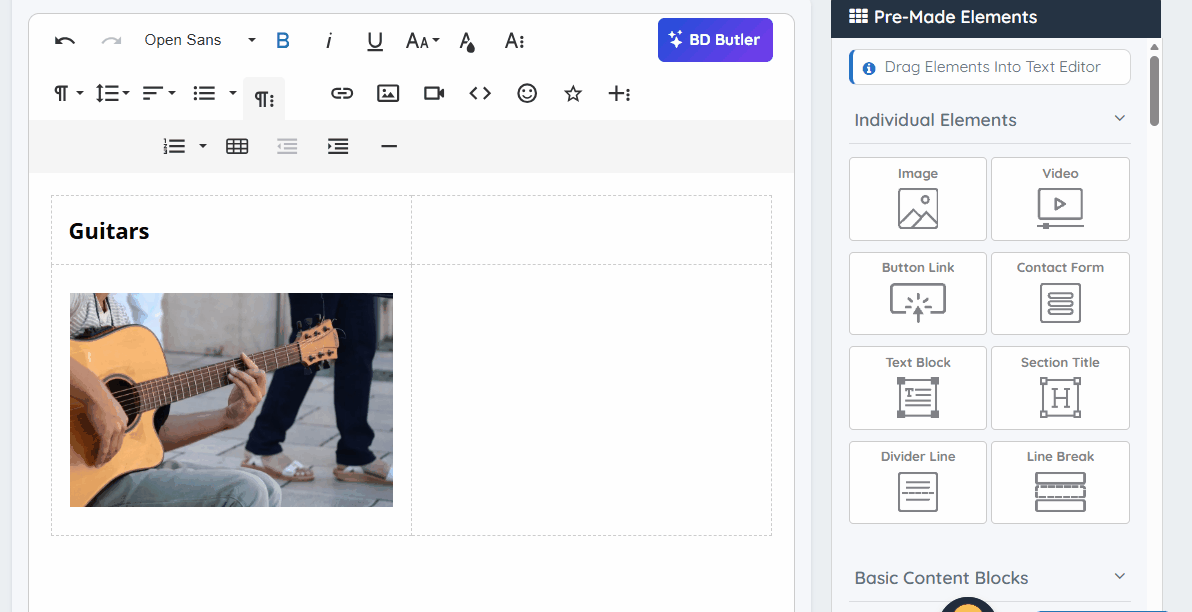
The available options to edit are explained below:
Move Content Block
This user-friendly feature that gives the ability to move content blocks, including tables, seamlessly across the page. By highlighting the table, users can reposition it within the content without needing to cut and paste. This feature is particularly helpful for quickly reorganizing layouts during editing.
Clone Content Block
This allows users to effortlessly duplicate a table and its contents. This is particularly useful when there is a need to reuse a similar table structure or data across different sections of the page without having to recreate it manually.
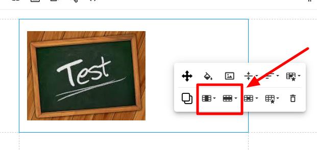
Columns and Rows
These options makes it easy to add, delete, and customize columns and rows in a table, offering full control over the table's structure and layout. This feature ensures that users can adjust their tables dynamically as their content evolves.
The available settings for these options are:
Columns
These are the available options in the dropdown menu:
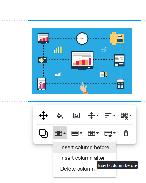
Insert Column Before:
Adds a new column to the left of the selected column.
Insert Column After:
Adds a new column to the right of the selected column. 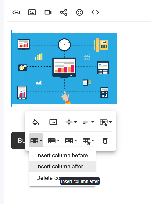
Delete Column:
Removes the selected column from the table.
Rows
These are the available options in the dropdown menu:
Insert Row Above:
Adds a new row above the selected row.
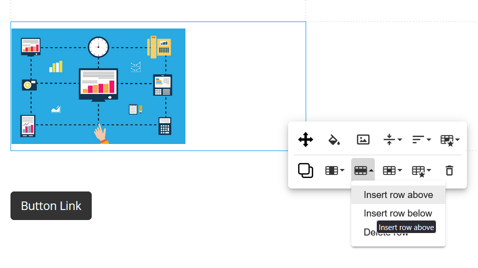
Insert Row Below:
Adds a new row below the selected row.
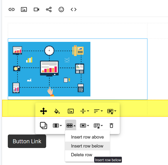
Delete Row:
Removes the selected row from the table.
Merge Cells
This allows users to combine two or more adjacent cells within a table into a single, larger cell. This is especially useful for creating more complex table layouts or organizing content in a visually appealing way.
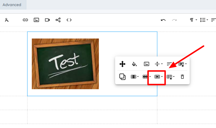
Table Style
Table Style Options control how tables are displayed and formatted across different devices. These settings adjust the table’s design, responsiveness, and visibility on mobile and tablet screens.
Content Box Design
Applies a predefined design to the table, adjusting its styling for a more structured appearance.

Grid on Mobile
Ensures the table displays in a grid format when viewed on mobile devices.

Hide on Mobile
Hides the table when the website is accessed from a mobile device.

Hide on Tablet
Hides the table when the website is accessed from a tablet.

Hide on Desktop
Prevents the selected element from being displayed on desktop screen sizes.
Background Color
This feature that allows users to enhance table aesthetics by applying colors to individual cells, entire rows, or columns. This feature is particularly useful for creating visually appealing tables, emphasizing important data, or categorizing information.

Insert an Image
This allows users to insert images directly into table cells, making it possible to combine text, visuals, and data in a structured format. This feature is especially useful for creating product catalogs, visual data presentations, or multimedia-rich tables. For more information, click on this article How to Post Images On WYSIWYG Editors

Vertical Alignment
This allows users to adjust the position of content within a table cell, offering flexibility to align text, images, or other elements at the top, middle, or bottom of the cell. This ensures a polished and professional appearance for table layouts.

Horizontal Alignment
This allows users to precisely position content within table cells along the horizontal axis. Whether it's working with text, images, or other elements, this feature provides options to align content to the left, center, right, or justify it across the cell.

Cell Style
This offers advanced customization options for table cells, allowing the editor to adjust padding for different visual effects and control the visibility of cells across various devices (mobile, tablet, or desktop). This flexibility ensures that the tables are not only visually appealing but also responsive to different screen sizes.
No Padding:
Removes all internal spacing within the cell.

Medium Padding:
Applies a moderate amount of internal spacing within the cell.

Large Padding:
Applies a significant amount of internal spacing within the cell.

Extra Large Padding:
Applies a substantial amount of internal spacing within the cell.

Hide on Mobile:
Prevents the cell from being displayed on mobile screen sizes.
Hide on Tablet:
Prevents the cell from being displayed on tablet screen sizes.
Hide on Desktop:
Prevents the cell from being displayed on desktop screen sizes.
Image Style
This option is to apply various styles and effects to images embedded in tables. The editor can adjust the shape, size, and behavior of images, ensuring they align with the design preferences and are responsive across different devices.
Square:
Displays the image with sharp, 90-degree corners.

Rounded:
Displays the image with softened, rounded corners.

Circle:
Displays the image within a circular shape.

Enlarge on Hover:
Increases the image size when the mouse cursor hovers over it.
Shrink on Hover:
Decreases the image size when the mouse cursor hovers over it.
Hide on Mobile:
Prevents the image from being displayed on mobile screen sizes.
Hide on Tablet:
Prevents the image from being displayed on tablet screen sizes.
Hide on Desktop:
Prevents the image from being displayed on desktop screen sizes.
Remove Table
This allows the users to quickly delete an entire table from the page. This is especially useful when there's no longer a need for a table or want to replace it with a different layout.

To learn more about Froala tables, please read this article: Web Page Builder: How Tables, Columns and Rows Behave on Mobile Devices